
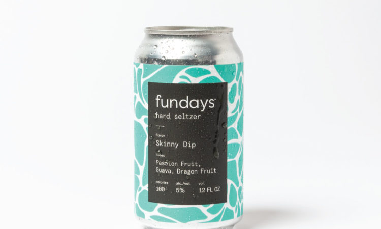
How to Package Fun
When a branding agency launches a product of its own, you can be sure every aspect of the packaging is carefully considered. Chad Hetherington, co-founder and CEO of The Stable, based in Minneapolis, takes us inside the content strategy and design for fundays, its new hard seltzer now available at Target and other major retailers.
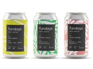 Font: GT America Mono, to embody playfulness
Flavor names: They’re cheeky—meant to bring flavors to life. And occasion-driven—designed to evoke garden parties, barbecues, tailgating, and even skinny-dipping. (Suggested social media caption: “fundays required, bathing suits optional.”)
Colors: Bright, lively, uplifting
Pattern: Each fundays flavor has a corresponding pattern to help with recognizability and differentiation (and to look great on Instagram).
Dietary benefits: are front and center because they matter to this target audience.
“We know our audience is heavily influenced by aesthetics, authenticity, and clean ingredients.” —Chad Hetherington
Target dems: Urban professionals, 21-30; “cool parents,” 32-48; and “glory days shoppers,” 45-60, parents of teens/empty nesters who turn to social media for brand recommendations.
Read more from this issue

Insite
The International Wine and Spirits Record (IWSR)predicts that by the end of 2021, the seltzer and ready-to-drink category will be bigger by volume than total wine sales.
“Believe it or not, we identified white space in the seltzer market, leveraging our analytics and insights team, and found that there was real opportunity to build a brand, with unique flavors aimed at Gen Z and millennials, that didn’t take itself too seriously.” — C.H.