
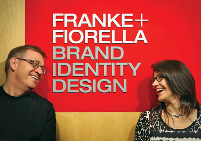
Don’t Lose Your ID
When Craig Franke and Deb Fiorella launched their eponymous brand identity graphic design firm 18 years ago (they’re spouses as well as business partners), print was the prince of media. These days, a crowd uneasily shares that crown. Though Franke+Fiorella remains focused on visual design, the Minneapolis agency now covers the wider waterfront of branding. And that fluid realm continues to broaden its banks. Brands have more touchpoints—and if they are to present a united look across platforms and across countries, businesses need a unified message.
 For MacPhail Center for Music, Franke+Fiorella created a typographic marque and marketing materials that updated the school’s “classical” image. One local violinist admired the simple line design (seen on the CD) so much that she had it tattooed on her bowing arm.
.jpg") In 2009, Franke+Fiorella launched a new identity and packaging system for Valspar that helped refresh the Minnesota firm. Says Fiorella: “We helped Valspar look more like a paint company.”
In 2009, Franke+Fiorella launched a new identity and packaging system for Valspar that helped refresh the Minnesota firm. Says Fiorella: “We helped Valspar look more like a paint company.” One of the numerous print materials the agency has designed for Mosaic, whose logo Franke+Fiorella developed.
“It’s always been very important to have standards in place so that employees don’t do different types of things [to a company’s look] and change how they’re expressing the brand,” Fiorella says. “But it’s becoming critical that they have these tools in place to help guide people, especially in global companies.” The agency talks about how the brand lives and behaves in social media, and works with clients to help them establish how they express their brand visually; they also look at how tone of voice comes across differently on Facebook versus Twitter versus LinkedIn, “so that it’s still consistent, but it’s meeting [the client’s] strategy for each of those different venues,” Fiorella says.
“It’s almost like there’s a different dialect for Twitter versus Facebook versus LinkedIn,” Franke adds.
But underlying these dialects is one mother tongue—building business. “It is really critical that a brand is consistently expressed visually and through words so that there isn’t fragmentation,” Fiorella says. “The story needs to be the same. A brand is a relationship between a company and its user or its audience. Like any relationship, consistency breeds trust and familiarity.” Strong, consistent design, she argues, elevates the perception of the brand and helps it stand out in a commercial world where people are more and more used to good design. Mediocre design lowers the brand’s perceived value.
Franke+Fiorella’s clients include Cargill (it designed the ag giant’s current logo) and Valspar. Another local client with a large global footprint is 3M. The agency’s work in visually unifying 3M’s diverse businesses, and subsequently branding various product lines, earned several design awards last year.
Franke+Fiorella also works for Minnetonka-based Mosaic, where the agency’s original branding work in 2006 was designed to represent the newly formed Fortune 500 company that combined Cargill’s divested crop nutrition business and its longtime rival, Illinois-based IMC Global.
“[Mosaic] had no history,” Fiorella says. “What they had was the legacy of the other two companies to go on. They had to leverage that going forward.” The message of the branding communications work that Franke+Fiorella developed: “Together we’re going to bring Mosaic to life.”
Rob Litt, Mosaic’s lead external public affairs manager, terms Franke+Fiorella “a valuable strategic partner” in Mosaic’s ongoing branding efforts. “We’re a global company and we need to have our brand’s imagery to have the same look and feel” in every country it works in.
Another notable recent agency client: itself. A couple of years ago, Franke+Fiorella saw that its own brand needed some fresh energy. Its logo colors had grown staid, and the logo itself was horizontal. “That really did not work at all in the social [media] space,” Fiorella notes. The new logo, the foundation of the agency’s own marketing materials, is an energetic persimmon color. What’s more, it’s square—a shape that better fits the avatar positioning on social media platforms.
Digital communications have offered other benefits to Franke+Fiorella besides an opportunity to expand its capabilities—namely, its first overseas client. Sicily-based travel company Italian Connection got wind of the firm’s work, believed the Minneapolis shop could help it stand out in the U.S. market, and shot Franke+Fiorella an email. The agency, whose identity and Web work launched in 2008, has never met its Italian clients in person.
But even with all the high-speed, high-tech innovations in communications technology, Franke+Fiorella’s founders are finding that the more things change, the more they stay, if not the same, at least rooted in the same ground. “When we went from print to the Web, that was a huge divide,” Franke says. “There wasn’t a lot in common—one could do one thing well, the other could do something else well. But now we’re coming back with the iPad and the tablet to something that’s a lot more like paper, like print.”
Unlike a generation of business leaders who came of age before Apple, up-and-comers understand the importance of design and brand. Businesses can no longer treat it as an afterthought. “Design and brand have taken a different, and, I think, much more prominent role in most people’s lives,” says Franke, who adds: “You can’t launch a company these days without a strong brand.”